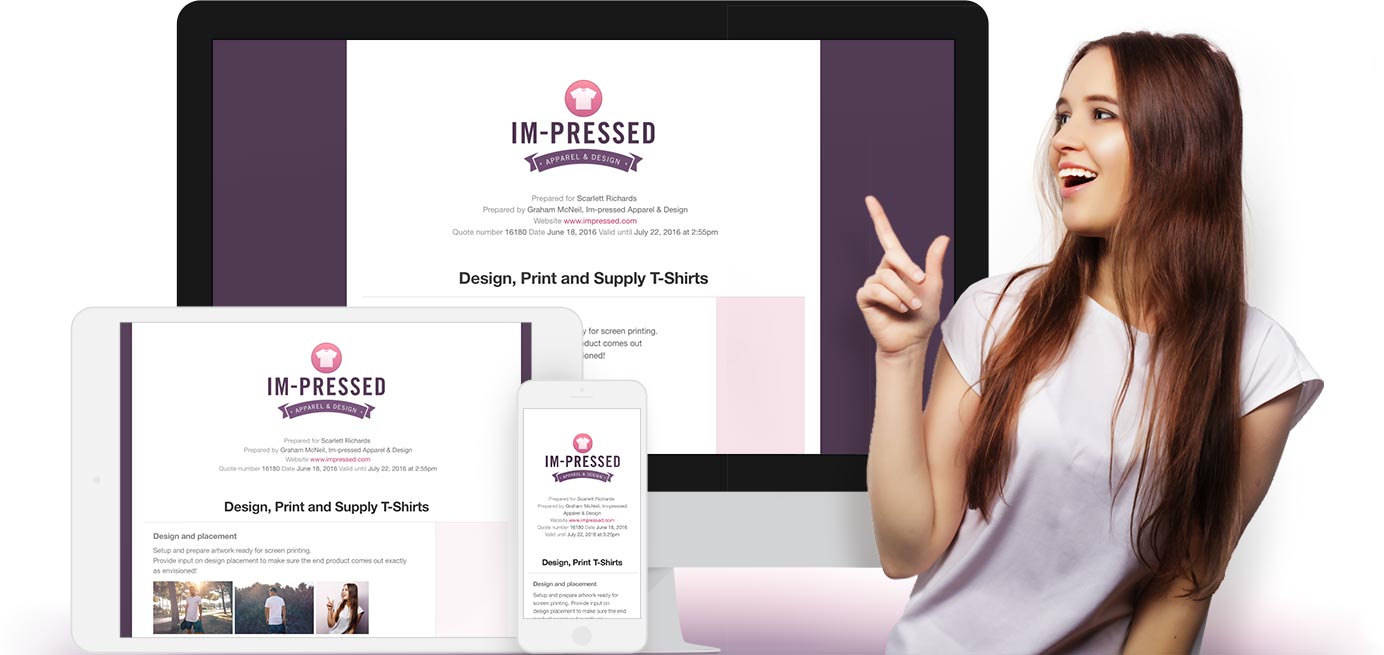
Today, quotes get a brand new look. We’re excited to bring you a range of new options, allowing you to easily tailor the look and feel of your quotes like never before.

Up until today, your logo and contact details have always been in the trusty right column. Now, you can move them to the very top, which allows the rest of the quote to use the full width. This new layout is easier on the eye and will help your customers focus on the details that matter.
Furthermore, you can choose to center contact details beautifully in-line (for a proposal look), or organize them in columns (ideal if you choose to display full customer details).

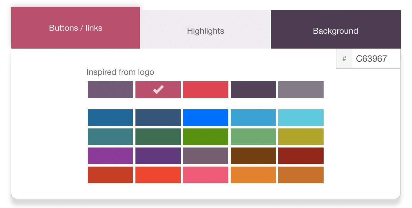
All-new colors inspired from your logo
There’s a new palette of colors picked especially for you. Selected algorithmically from your logo, your links and highlights will be 100% on-brand every time. It’s just too easy! In fact, it’s been so effective in our testing, we fired our own in-house designers (not really).
Also, you can now set a background color to give your quote that extra “pop”.

Preview your layout before saving
There’s also a handy “live” preview, where you can check your changes instantly. And you can click to see a full-size example before saving and publishing your handy work.
To explore these new options, go to (admins only): Settings > Layout, style and company information.
We hope you enjoy these latest updates and be sure to check out the new quote examples to see what’s possible and get some inspiration for your own quotes. As always, we welcome your feedback and we would love to hear from you.
Quotient