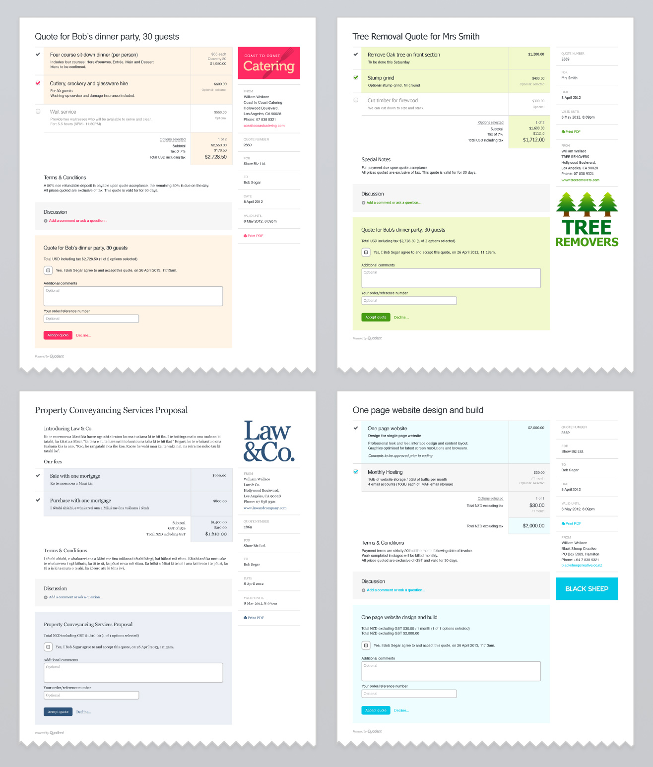
Today we’re thrilled to give you more control over the appearance of your quotes and emails – so that they better reflect your business, your brand and your personality!
Start by choosing a layout
There are two fresh new layouts to choose from. With the quote number less prominent and also, as requested by many, you can choose to place your logo and address information nearer the top.
Color options, for buttons, links and highlights
Choose a color for the quote acceptance button and for links, which includes the link color in the quote notification emails. Choose a secondary color for highlights – used on the selected line items and on the acceptance form. You can pick from our recommended color swatch themes or enter your own custom hex value.
Select a font and style
We still love Helvetica, but you can choose for yourself an alternative san-serif font, Tahoma. For a more formal look, the serif font Georgia or Times New Roman. You can also choose to have regular (non-bold) headings.
All of this can be done in Account settings > Quote appearance and layout.

Also: a handy new Account Options menu
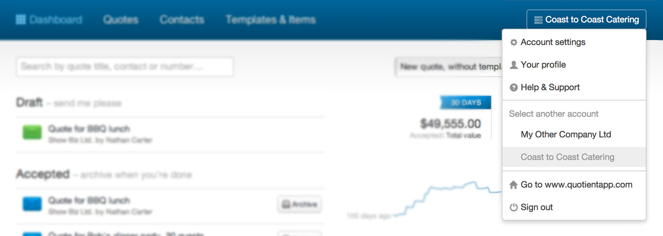
This is the one place to access a whole bunch of important things. See top-right of the Dashboard (the name of your account). Click to expand and quickly navigate to:
- Account settings
- Your profile
- Help & Support
- Sign out
If you have more than one account, they’ll appear in this menu also, making it much faster to switch between accounts.

We hope you enjoy these updates.